One Gen Church · Brand System v1
Everything on this page is approved. The colors, the type, the logos, and the way we treat photography. If you are making something for One Gen, pull from here so it looks like us every single time.
Two approved marks. The full wordmark with the roof and cross is primary and leads on anything official. The OG monogram is secondary and works where the space is small or square, like a profile picture or an app icon.
Both marks keep their own colors. The wordmark stays slate and sage. The monogram keeps its gradient. Do not recolor either one purple to match the rest of the system. Purple is the campaign color, the logo is the logo.
Cream leads. Ink purple holds the page up and carries body text. Royal purple is the loudest voice and gets used once per screen, on the thing you want clicked. Lavender is a surface only, never put body text on it.
Two typefaces, ever. Anton for display, set in all capitals and packed tight. Helvetica Neue, or Inter on the web, for everything you actually read. Never set body copy in Anton and never set a headline in the UI face.
Buttons change color on hover, never size. Every corner, gap, and pad comes off the 8px grid.
Every Sunday at 9:00 AM CST. Doors open early, coffee is on us.
Every dollar stays in this community and goes back into the work.
Can't make it in person? The stream starts fifteen minutes early.
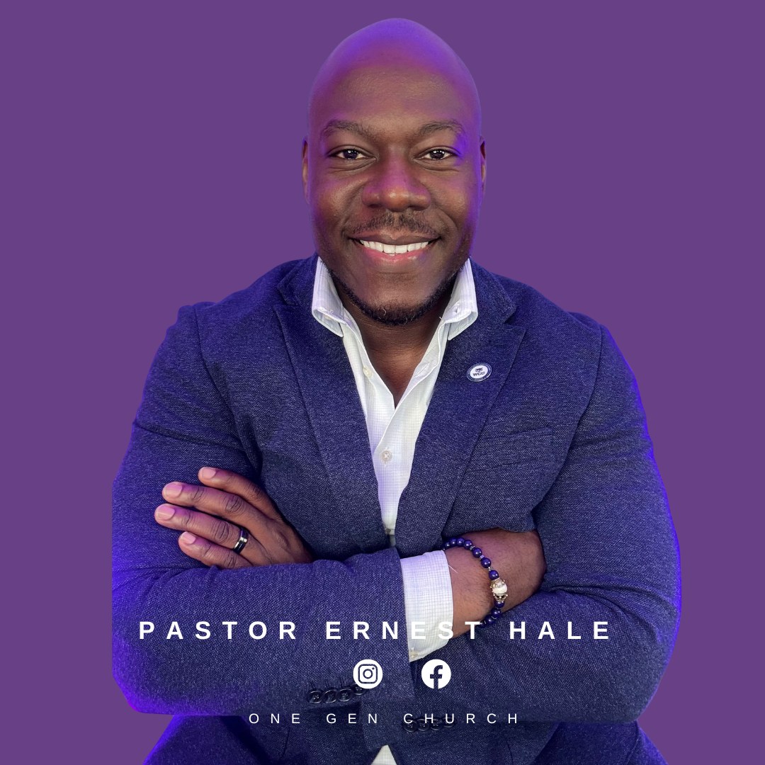
Full color is the standard. Pastor Hale is shot straight on, cut out clean on a transparent background, with natural skin tones and no heavy filter. Drop him onto One Gen Purple and set his name underneath. Faces stay fully visible and are never covered by type.
Never let an AI model draw Pastor Hale. Every one of them drifts. They narrow his features and lighten his skin toward their own average, and the result lands near him instead of on him. He will notice, and he will be right. Generate everything else you want. Place his face, never generate it.
If you do generate a person for some other reason, the models rank this way on holding a Black man's likeness: Nano Banana Pro is clearly the strongest, GPT Image 2 is usable but slims the jaw, and Seedream drifts the worst. Better is not the same as solved. The cutouts below exist so you never have to make that trade.
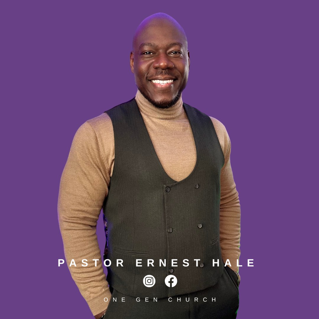
All transparent PNGs at 1080 x 1080. Drop them straight onto purple. The vest set is the newest and the strongest, use those first.
The standard social card. Square at 1080 x 1080, One Gen Purple background, cutout bleeding off the bottom edge, his name in wide letterspaced capitals, then the social icons, then the church name. Use these as they are. Do not re-crop them or change the type.
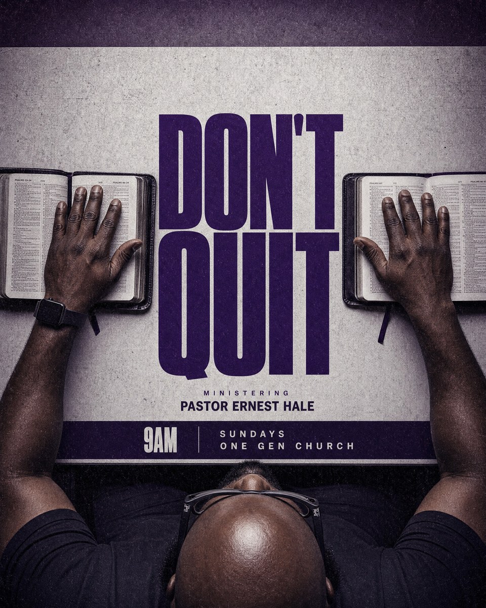
Approved creative directions, with the exact recipe that produced them. Anyone making a flyer can copy the prompt, change the sermon title, and get the same look. This section exists so the style survives even when the person who made it is not in the room.
Replace [SERMON TITLE] with the new title. Keep everything else exactly as written.
The FIRST reference image is a poster layout guide. The SECOND reference image is a photograph of a real man. Create a new church sermon flyer in the style of the first image. Overhead photograph looking down at a table: the dark brown hands and forearms of a Black African American man rest on two open leather Bibles, one on each side of the frame. At the bottom of the frame you see him from above and slightly in front, so his completely bald smooth head, his dark beard and his black Ray-Ban Meta smart glasses are all clearly visible. He is solidly built with broad shoulders, like the man in the second reference. He wears a dark shirt. Grungy textured paper background with heavy grain. Between the two Bibles sits an enormous heavy condensed sans serif headline stacked tight on two lines in deep royal purple, reading [SERMON TITLE]. Write the words exactly as: [SERMON TITLE] Below the headline small letterspaced capitals read exactly MINISTERING and under that in bold capitals PASTOR ERNEST HALE. A dark horizontal bar near the bottom holds 9AM on the left and SUNDAYS ONE GEN CHURCH on the right. Colour palette strictly purple: deep violet, royal purple and plum on desaturated warm grey. No red, no orange, no blue. Cinematic, moody, high contrast. Perfect spelling.
Copy these exactly. Same wording on every flyer, post, and page so the church reads as one voice.
Paste this into any stylesheet and the whole system comes with it.
:root{
--cream: #FBEFE3; /* default background */
--ink: #381255; /* body text, structure */
--royal: #5B1CA7; /* primary action, once per screen */
--mid: #512A75; /* secondary text */
--lavender: #CDA2D7; /* surface only, never text */
--lavender-tint:#EFE2F3; /* soft panels, borders */
--s1:4px; --s2:8px; --s3:16px; --s4:24px;
--s5:40px; --s6:64px; --s7:96px;
--radius:14px;
--radius-pill:999px;
--hairline:rgba(56,18,85,.10);
--shadow:0 1px 2px rgba(56,18,85,.04);
--display:'Anton', Impact, sans-serif;
--ui:'Inter', 'Helvetica Neue', Arial, sans-serif;
}